Bright Rich is a member of CORFAC International, an international association of professional brokerage companies. As of today, their portfolio of transactions is higher than 1.9 million sq. m. The branches are located in Dubai and Almaty, Moscow and St. Petersburg.
The site had accumulated a lot of problems, which were slowly fixed by an in-house specialist. The company was planning to expand into Kazakhstan and the United Arab Emirates, so we were tasked with getting the site up and running as quickly as possible. For this purpose we planned to:
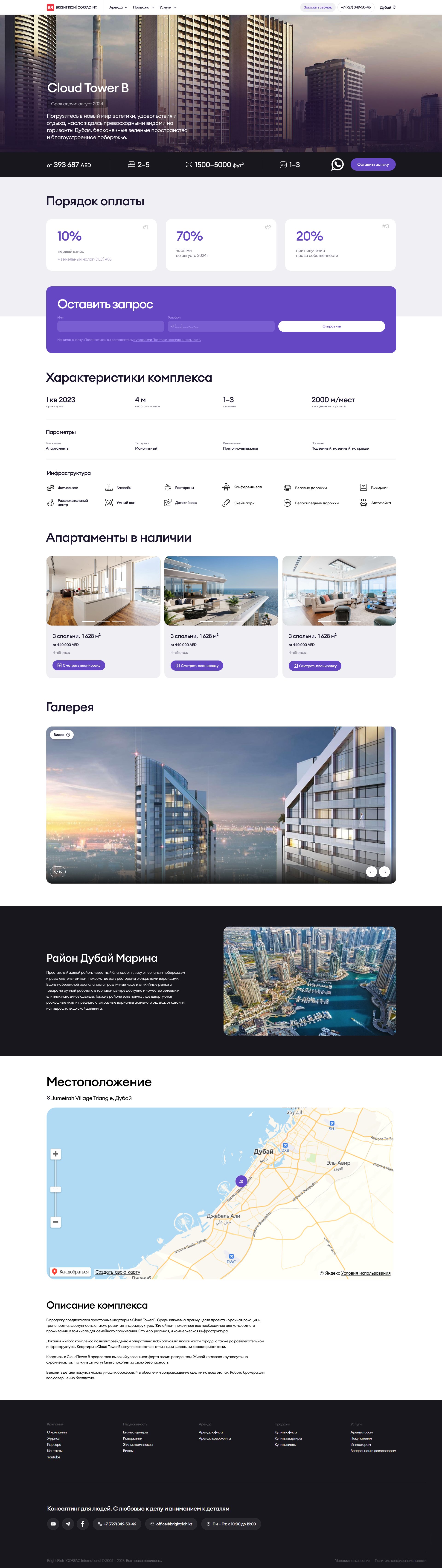
Two additional page types were added during the migration. They required branding using existing design tokens and components.
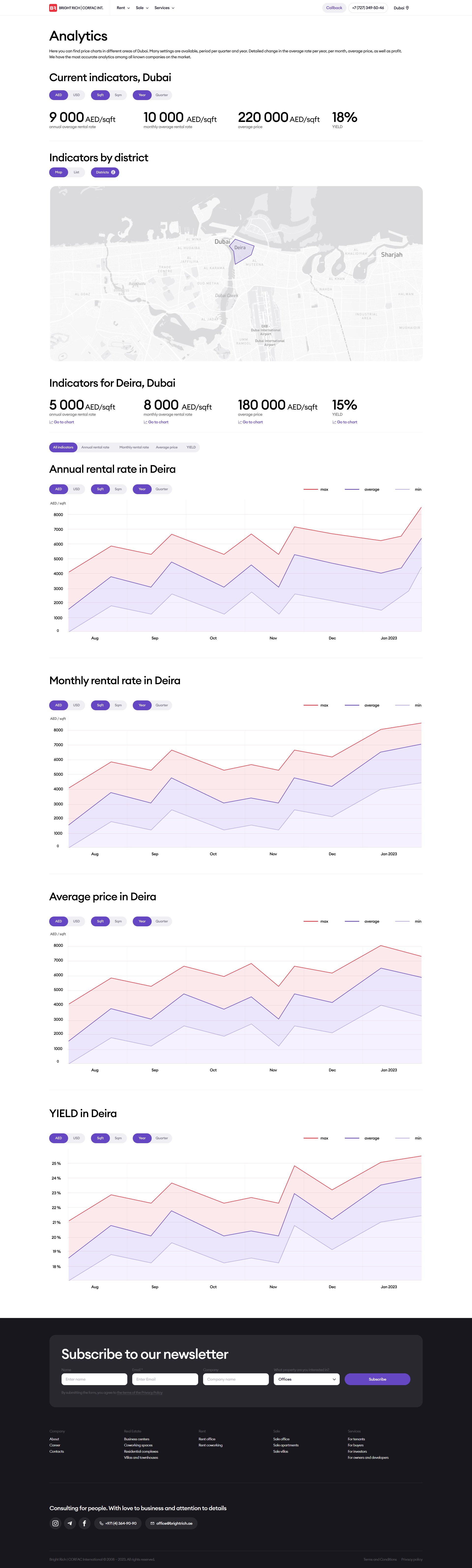
Over 40 icons related to the infrastructure were selected and given a consistent style.
The site's use of the Bootstrap library was excessive and unproductive. Only grid-related classes were used consistently, while styles for other elements were often redundant and overriding the library's default styles. The HTML code contained excessive nesting.
Some elements changed as a result of the audit, requiring code refactoring in any case. It was also planned to introduce new page types and elements. Rewriting the code from scratch will ensure future scalability and easy maintenance.
The new website was developed with Smarty Templates and SCSS.
An interim version of the rewritten code is available on GitHub.
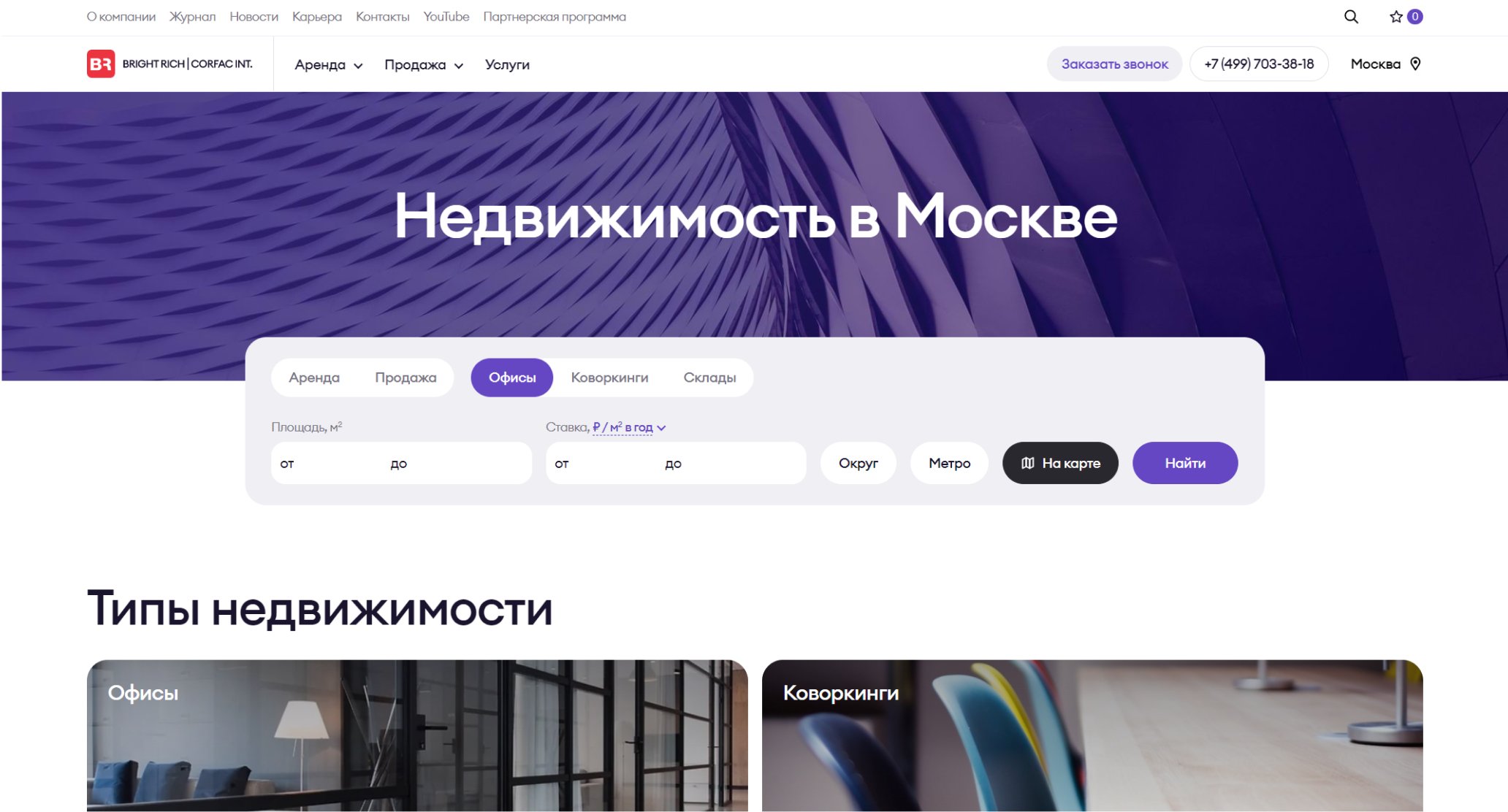
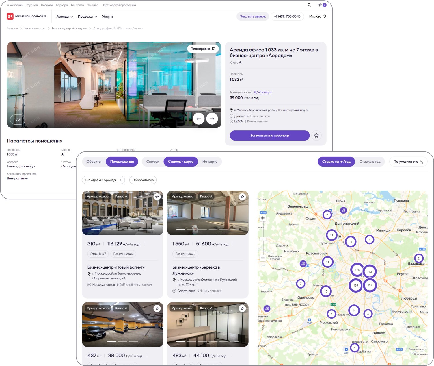
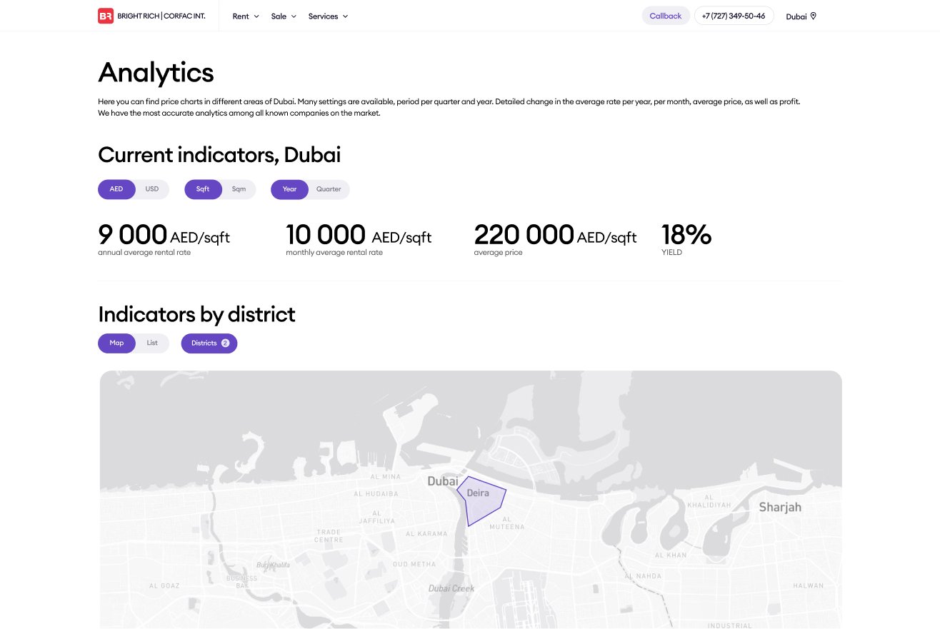
Other issues were usability related
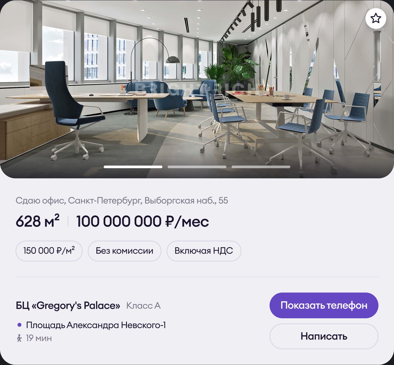
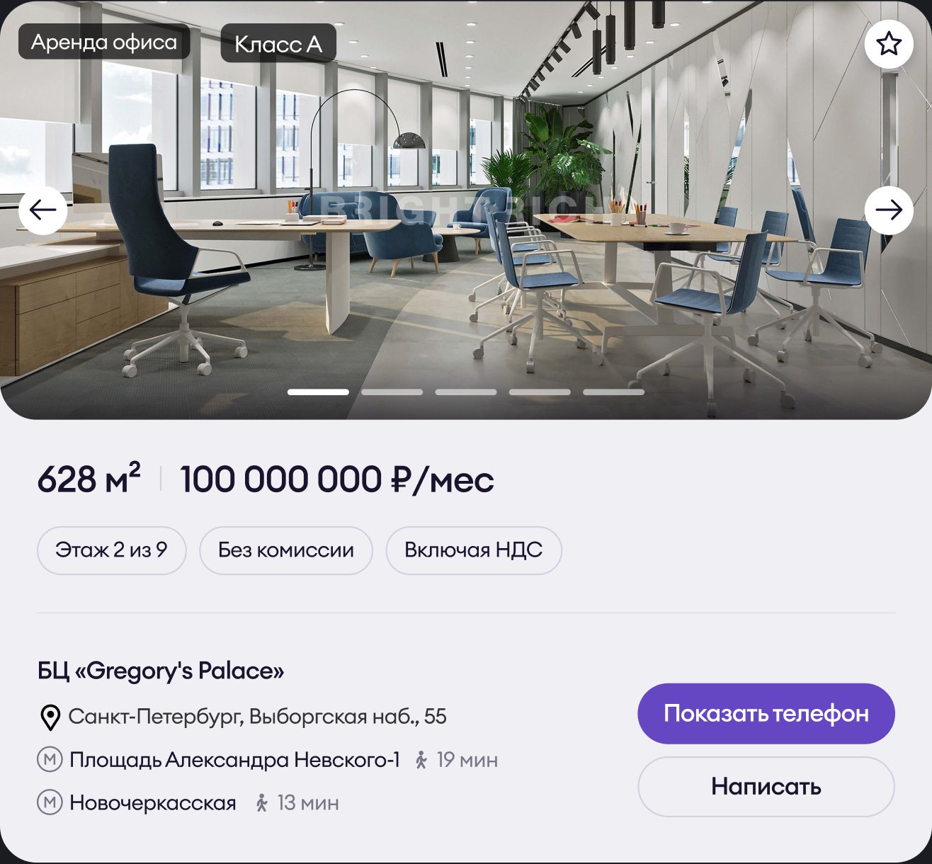
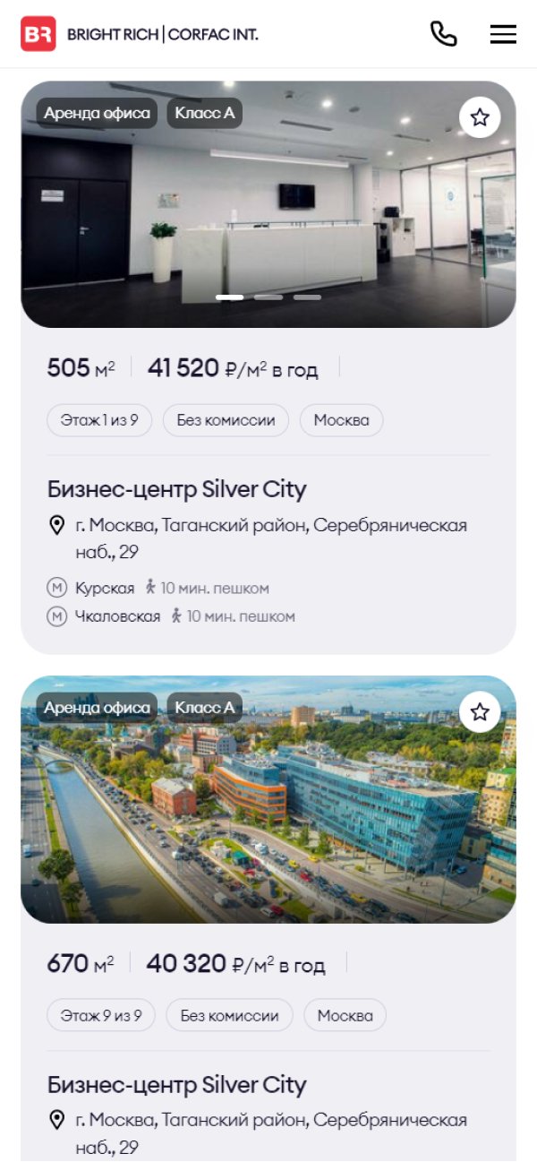
The image preview button appeared only on hover. It was difficult to understand that there are move offers below because the scroll appeared only on hover as well.
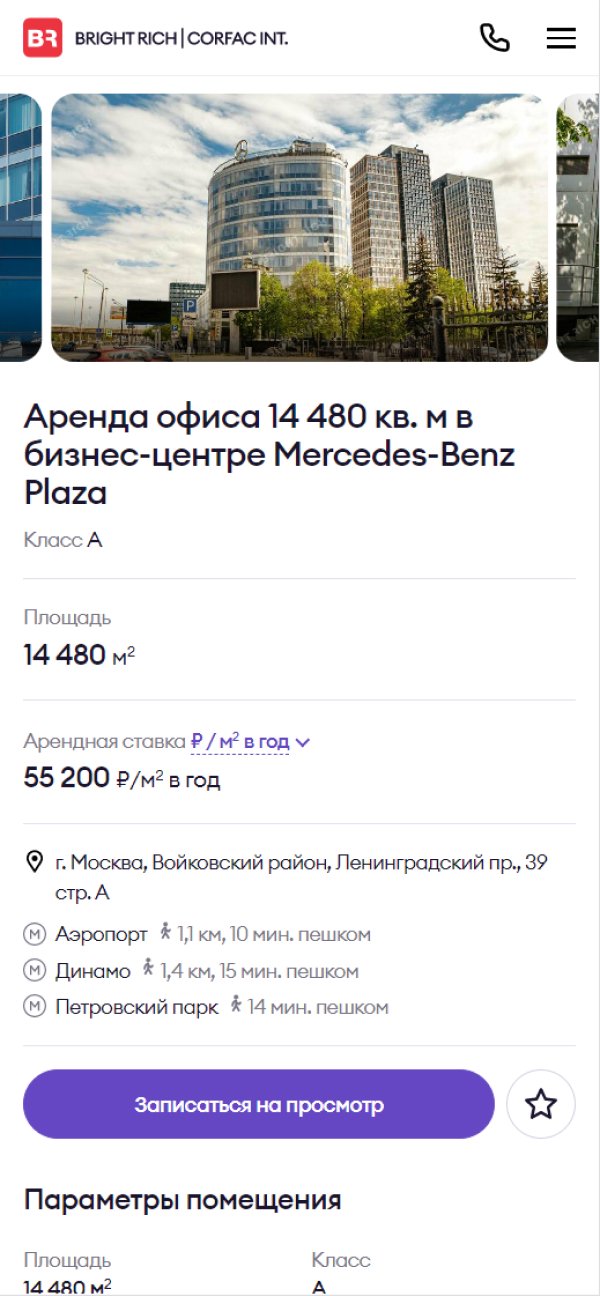
The icon was replaced with the real photo. Offers list is no longer truncated. If the list is too long, you can view the full list using the "view more" button.
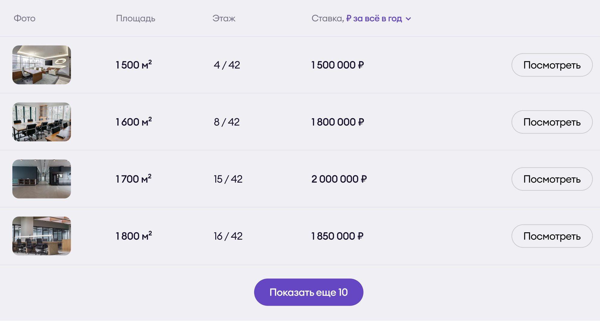
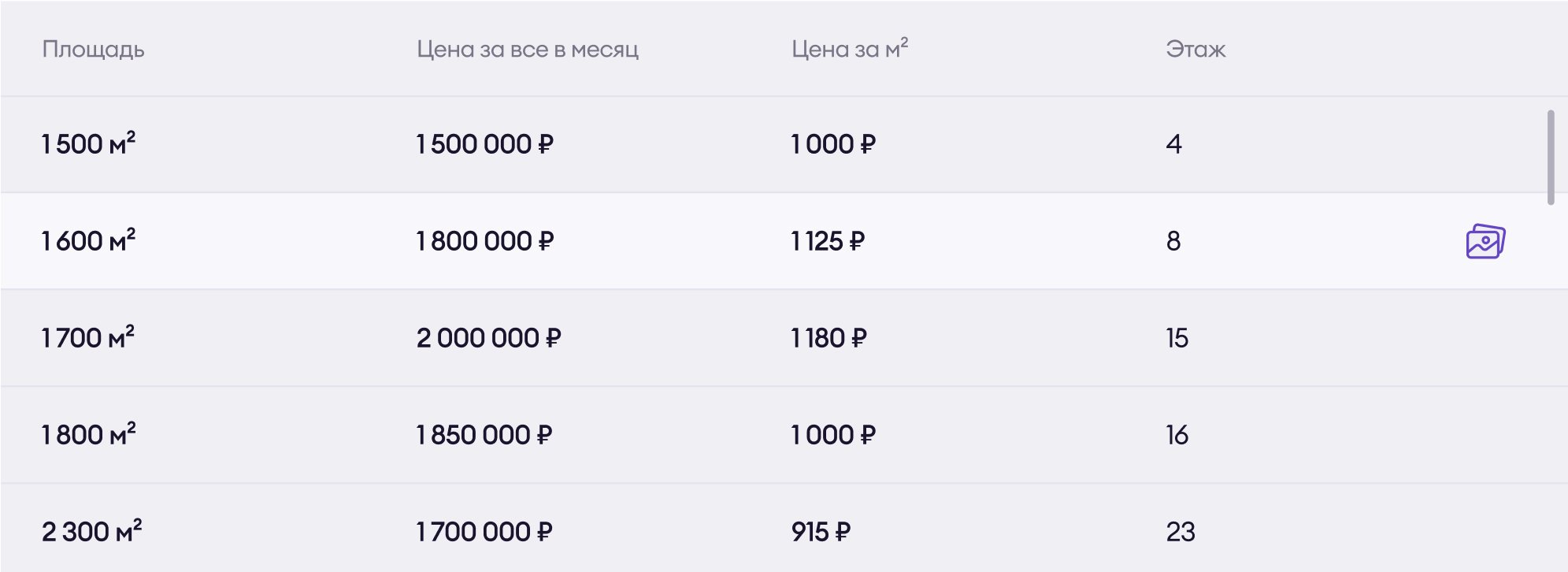
Vertical slider depending on scroll had a very bad performance. The number of items was unpredictable for user and the button for skipping this functionality was unnoticeable.

A classical slider with an autoplay and manual scrolling options.

A title with the functionality of the select. A very subtle dropdown arrow. It's impossible to predict which options you might find.
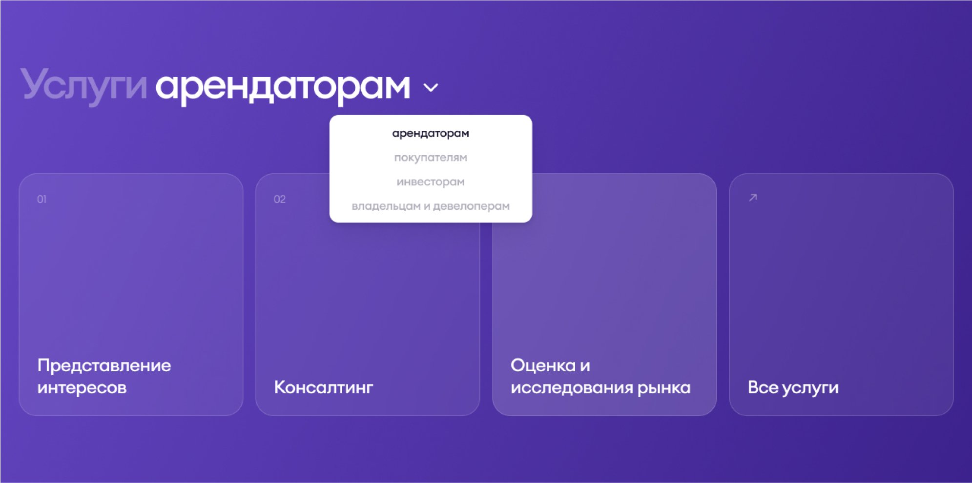
All possible options are shown at once through tabs.
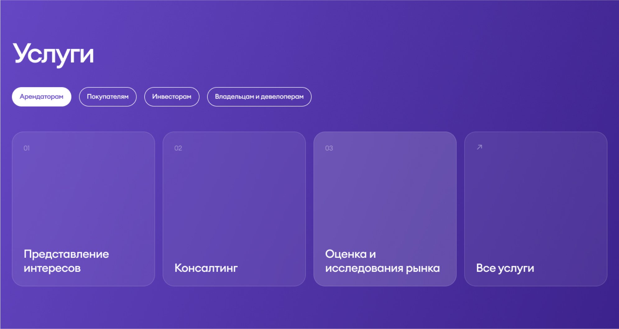
Contains lots of sliders, tabs and other interactive elements
-50%
the style files have been reduced
+12%
the performance increased
100+
fixes and improvements
working on front-end has taken
More for Bright Rich
BR Home, BR Cash, BR CRM etc.
2022–2024
View project
Restte
Online furniture store in HoReCa segment
2021
View project
Electrics
Original Schneider Electric and Jung products
2020
View project